Welcome to the State of Global Air Interactive Website guide! The objectives of this guide are to provide instructions for creating, exploring, and downloading:
- Comparative Air Quality or Health Impact Plots
- Downloading Plot Images and Data
- Global Maps of Air Quality and Health Impact
- Cause-specific Plots
- Air Quality and Health Impact Data Tables
Part 1: Comparative Air Quality or Health Impact Plots
- Select either the ‘Air Quality’ or ‘Health Impact’ tab. By default, the ‘Air Quality’ will be selected. When a tab is selected, the text color will be gold and the tab will be dark blue.
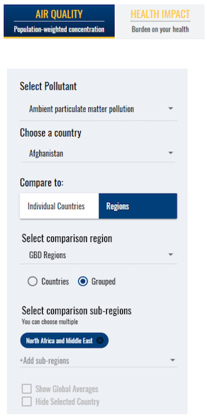
- Use the menu on the left side of the screen to define the parameters of your search. Parameters for both air quality and health impact are pollutant, country, comparison country or region, and sub-comparison region as illustrated below (more information on regions and sub-regions).
- The health impact search has an additional category for measures of health burden which include a choice of the numbers or rates of premature deaths or of disability adjusted-life-years or DALYs which are defined in the glossary and explained in more detail in the report.
- Select from one of three pollutants: ambient particulate matter pollution, ozone, and household air pollution. For health burden, there is an additional category, 'Air Pollution', which is the sum of the contributions of particulate matter pollution, ozone, and household air pollution.
- You may compare the selected country to other regions and sub-regions. When you select a country, by default the comparison region is the Global Burden of Disease (GBD) region and the sub-region is the specific GBD sub-region the selected country falls into. For example, if you select Afghanistan in the 'Choose a country' dropdown menu, the default GBD sub-region is North Africa and the Middle East. The plot generated will display data for the selected country (Afghanistan) and the average value for all of the countries within that GBD sub-region (for example, how Afghanistan compares to all of North Africa and the Middle East). If you would like to see how Afghanistan compares to all countries in the North Africa and the Middle East GBD sub-region, click on the 'Countries' button below the ‘Select comparison region’ dropdown menu.
- If you are interested in changing the comparison region, click on the ‘Select Comparison Region’ dropdown menu and select a new region or grouping. The other comparison regions include: Four World Regions, GBD Super Regions, Socio-demographic Index, World Bank, World Health Organization, and World Bank Income Levels. More information on these regions or groupings and the countries they include can be found by clicking here. You can compare your selected country to another country by clicking “Individual Countries” in the comparison region dropdown menu.
- To view plots and data for multiple sub-regions, click “+Add sub-regions” and select additional countries/regions. You may select regions individually from the drop-down menu or choose ‘Select All’ at the top of the list to choose all countries within that region. You may undo choosing all countries within that region by clicking on the ‘Unselect All’ button that appears before the blue buttons for each country that appears under ‘Select comparison sub-regions’.
- The line representing global mean levels can be added to any plots by selecting the ‘Show Global Averages’ square below “Select Comparison Sub-regions”. Here, you may also click on the “Hide Selected Country” box to hide data for the country chosen at the start of the analysis (e.g., Afghanistan).
- If you are interested in specific data points, you can click on the plotted dots to view specific numerical data.
- You can also zoom in on any plot using the mouse to draw a box around the points of interest. To zoom out press the 'Reset zoom' button in the upper right-hand corner of the plot.
Part 2: Downloading Plot Images and Data
There are a number of ways to download both the plots and the data you worked with in Part 1. The following steps will assist you in obtaining these downloads.
- To download the image of a plot, select the black arrow menu on the top right side of the plot. Please note that you may also download a zoomed-in view of a plot.
- Select the image download type of your choice. Options include PNG image, JPEG image.
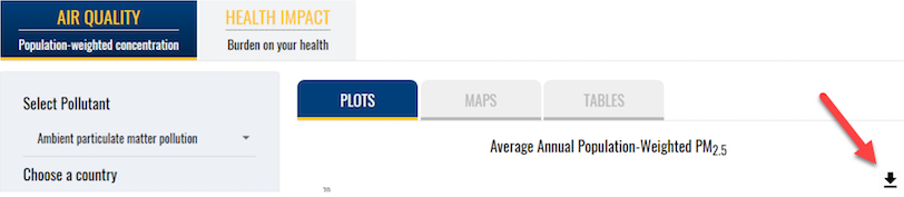
- If you are interested in downloading the raw data you see on the plot, select the arrow and then ‘Download CSV’.
Part 3: Global Maps of Air Quality and Health Impact
This website includes interactive maps to display air quality or health impact for 2019. The
following steps will help you utilize the maps functionality.
- When the site opens, it is set to ‘Plots’ by default. Switch to maps by selecting ‘Maps’ from the tabbed menu above the plots.
- Air quality maps can display levels of annual average, population-weighted PM2.5 (ambient particulate matter pollution), ozone (ambient ozone pollution), or household air pollution. PM2.5 is the default pollutant. To change the pollutant, utilize the ‘Select Pollutant’ dropdown menu.
- Maps of health impact are available. Select ‘Health Impact’ on the top left side of the page and then select ‘Maps’. Health impact maps can display burden for populated-weighted PM2.5, ozone, household air pollution, or all air pollution (listed as ‘Air Pollution’).
- Health Impact maps offer four different health impact metrics: number of deaths, number of DALYs, death rates, or DALY rates. You may choose either ‘Deaths’ or ‘DALYs’ from the drop-down menu under “Select Measure” and use the Number and Rate buttons to toggle between number of deaths and death rates and number of DALYs and DALY rates.
- View the map that launches when the ‘Maps’ tab is selected. The map includes the entire world. Each country is color-coded. The color code is described (including units) in the key to the left of the map. An example of a fully rendered map is below.
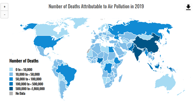
- On all maps, placing your cursor over a specific country on the map will pop up the data within your selected pollutant and health impact metric for the year 2019.
- Click on the ranges in the map key to turn the display of countries in the selected range off and on. For example, in the map above, if you’re only interested in displaying countries where the ambient average is between 45 and <75 µg/m3, click on the other ranges to toggle them off. If you’d like to view those ranges again, click on them to toggle them back on. Any given range will appear grey when toggled off and will appear black once selected again.
- You can zoom in and out on the map using the stacked plus and minus buttons on the top left side of the map.
- If you are interested in downloading the map image, or downloading map data, use the arrow menu to access that functionality. Please note that you may also download a zoomed-in view of a map.
Part 4: Cause-specific Plots
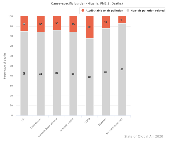
This year, the data app includes information for cause-specific health impacts of air pollution in countries around the world. The plots include ischemic heart disease, lung cancer, chronic obstructive pulmonary disease (COPD), lower-respiratory infections (such as pneumonia), stroke, type 2 diabetes, and adverse birth outcomes. For ozone, COPD is the only health effect included in the analyses. See a sample below:
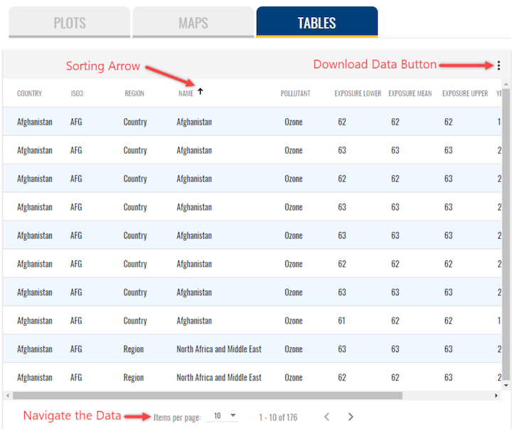
Part 5: Air Quality and Health Impact Data Tables
All of the data used to create the line plots are available to search, sort, and download from the site. The tables include data for all years (1990-2019). In addition, the tables include 95% upper and lower uncertainty intervals for the mean air quality and health impact measures.
- When the site opens, it is set to ‘Plots’ by default. Switch to tables by selecting ‘Tables’ from the tabbed menu above the plots.
- For table of air quality data or health impact data, set all parameters as you would for creating the plots (Part 1). The table will display the data based on the parameters that are selected. For example, if the country of Afghanistan is selected, with GBD regions, the subregion is automatically North Africa and the Middle East; data for all other countries in North Africa and the Middle East will appear in the data table. You can use the arrows at the top of each column to sort the data.
Download these instructions as a PDF:
